Introducing a few minor design changes and user experience upgrades
Twenity is a constantly evolving system, that gets updated on a weekly basis. We fully understand that details are very important for the general user experience, so, besides working on some major updates, we will be constantly upgrading what we already have. Like any other online system, there is always room for improvement, since perfection is almost impossible. Here are some new features we've introduced lately on Twenity.
Updated profile header
Some of you already know that Twenity allows people to add themselves to different lists, according to their timezone, user type and industries. While this may have been used for filtering various leaderboards, it didn't reflect on someone's profile page. The truth is, we didn't really have room for it, so we did something else, enabling a more detailed overview of the you or the person you're competing against.

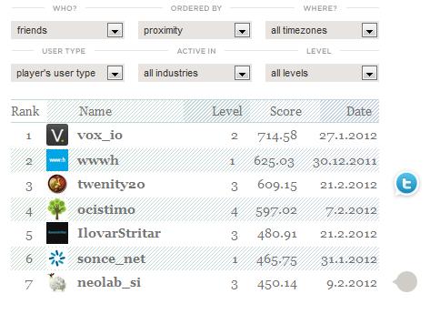
The profile leaderboard
The leaderboard on your Twenity profile enables you to see yourself as opposed to other friends / players. Since players are already in different levels, we've added the ability to compare yourself with people in the same level. Besides, if you're viewing someone else's profile, you can direclty see where they fit in the list.

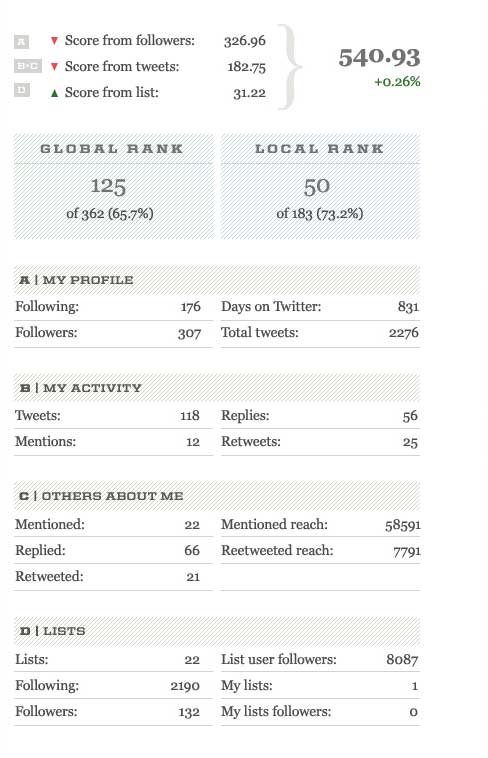
The score components description and change
We've received quite a few comments, where people were asking us how do the score components work, why their score fluctuates and which component influenced this change the most. Your wish is our command: now you can see which parameters are included in each component and how each element of the score changed since your last calculation on Twenity.

Going further
We have tons of other ideas, but are always open for your suggestions too. So if you think something can be improved, don't hesitate to contact us. We want to make Twenity as playful as possible, and we will be working hard on enabling just that. All of this is just the beginning.